
British Paints
01 Jun 2026 • Blog
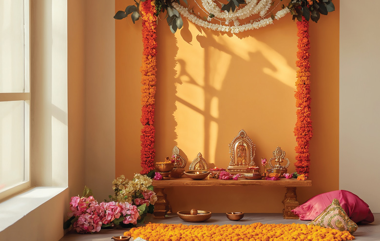
Top 5 Puja Room Colour Ideas as per Vastu Shastra The puja room is the one space in the home where most people do not want to get things wrong. It is personal, it is spiritual, and for many families, it sets the energy of the entire house. So when it comes to choosing colour, the pressure is real. Vastu Shastra offers clear guidance here, and the good news is that the colours it recommends are not restrictive. They are actually quite beautiful to live with. Why Puja Room Colour Matters in Vastu ShastraIn Vastu, colour is not decoration. It is energy. Every shade carries a specific vibration that either supports or disrupts the flow of positive energy in a space. The puja room, being the spiritual centre of the home, is where this principle matters most. The Science Behind Colour and Sacred SpacesColour psychology and Vastu arrive at similar conclusions by different routes. Soft, light colours reduce visual stress and create a sense of calm. Cooler tones lower perceived room temperature. Warm whites and creams create an inviting, restful atmosphere. In a space meant for focus, prayer, and stillness, these properties are not just aesthetically pleasing. They are functionally important. The direction the puja room faces also influences colour choice in Vastu. North-east facing rooms, considered the most auspicious direction, work best with white, cream, or light yellow. East-facing rooms suit light orange or yellow. The principle throughout is the same: keep it light, keep it clean, and keep it warm. Puja Room Colours (Vastu-Recommended)1. White: Purity and PeaceWhite is the most universally recommended puja room colour as per vastu. It represents purity, clarity, and the absence of ego. It reflects light beautifully, making even a small puja room feel open and bright. For families who want a timeless, unfussy backdrop for their deity idols and lamps, white is the easiest and most reliable choice. 2. Yellow: Positivity and ProsperityYellow represents Jupiter's energy in Vastu, symbolising knowledge, wisdom, and divine blessings. A soft, warm yellow on the walls gives a puja room an uplifting, joyful quality without feeling loud. Avoid deep or mustard yellows. Pale, pastel shades are what work here, keeping the tone devotional rather than decorative. 3. Light Blue: Calm and DevotionLight blue is associated with divinity, sky, and spiritual consciousness in both Vastu and Hindu iconography. It creates a cool, meditative atmosphere that encourages focus during prayer. For homes in warmer climates where the puja room can feel stuffy, a light blue wall also has a visually cooling effect that helps with concentration. 4. Green: Growth and HarmonySoft green is Mercury's colour in Vastu and is particularly well suited to north-facing puja rooms. It represents growth, renewal, and harmony, making it a meaningful choice for families who want the puja room to feel connected to nature. Keep the shade light and fresh, think sage or mint rather than forest or olive. 5. Cream / Off-White: Warmth and SacrednessCream sits between white and yellow in both colour and meaning. It carries the purity of white but adds a softness and warmth that feels more intimate. For pooja room paint colors, cream and off-white shades are particularly popular in smaller rooms where pure white can sometimes feel cold or clinical. They also pair beautifully with gold and brass fixtures, which are common in traditional puja room setups. Colours to Avoid in a Puja Room (Vastu Warnings)Vastu is fairly consistent on what not to use. A. Dark shades including black, dark grey, and deep red are considered inauspicious in puja spaces because they absorb light and, in Vastu terms, absorb positive energy along with it. B. Bright, aggressive colours like hot pink, electric orange, or neon shades bring a restless energy that is at odds with the stillness a puja room should hold. Bold feature walls and contrast colours, however fashionable they are elsewhere in the home, do not belong here. C. Brown and dark earth tones are associated with heaviness and stagnation in Vastu. They are not outright forbidden, but they work against the lightness and clarity that a puja room should have. How to Choose the Right Shade for Your SpaceThe Vastu principle gives you the colour family. The size and light level of your room helps you land on the specific shade. A. Small puja rooms with limited natural light need the palest versions of any recommended colour. A pale ivory or barely-there yellow keeps the room feeling open. Larger rooms with good light can carry a slightly deeper shade without feeling heavy. B. For pooja room paint design, think about the full picture before you commit to a wall colour. The flooring, the deity placement, the brass or marble work, the lamp, the curtain colour. All of these read alongside the wall. A pale sage green that looks perfect on a paint swatch can shift significantly next to terracotta flooring or a dark wood mandir. C. For the main walls, British Paints Optima All Rounder Emulsion is the product to reach for. It is available in the full range of Vastu-appropriate shades including soft whites, pale yellows, and light greens. The optima all rounder emulsion formula gives excellent coverage in one to two coats, which matters when you are painting a small room where every inch shows. D. For the ceiling and upper walls, British Paints Interior Emulsion in a white base keeps the room feeling airy and bright regardless of the wall colour chosen below. E. Before any colour goes on, apply British Paints Acrylic Wall Primer first. In a room as important as the puja space, a patchy or uneven finish is the last thing you want. Primer ensures the topcoat sits evenly and the colour reads true. F. For the door frame and woodwork, British Paints Enamel in white or a soft ivory gives a clean, finished edge that complements any of the puja room colour combination options above. Quick Puja Room Makeover Tips on a BudgetA. You do not need a full renovation to refresh a puja room. A single wall repainted in a Vastu-approved shade makes an immediate difference. If you are renting and cannot paint, a large piece of fabric or a painted wooden panel in white or yellow behind the mandir achieves a similar effect without touching the walls. B. Replace the curtain or the altar cloth in a complementary colour to reinforce the pooja room paint design choice. Add a brass diya or a small string of warm white lights. These are low-cost changes that shift the atmosphere of the room noticeably. C. If the room has not been repainted in several years, a fresh coat of British Paints Optima in the same existing shade is often enough to bring it back to life. Clean walls in the right colour do more for a puja room than any accessory. FAQsQ1: Which colour is best for a puja room as per Vastu? Q2: Can I use dark colours in a puja room? Q3: Is yellow colour good for a pooja room? Q4: Which British Paints shade is ideal for a puja room? Q5: What paint finish should I use for a puja room? Q6: Can I paint a puja room green as per Vastu? Q7: How often should I repaint my puja room? |