
British Paints
06 Jul 2026 • Blog
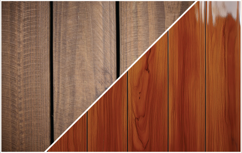
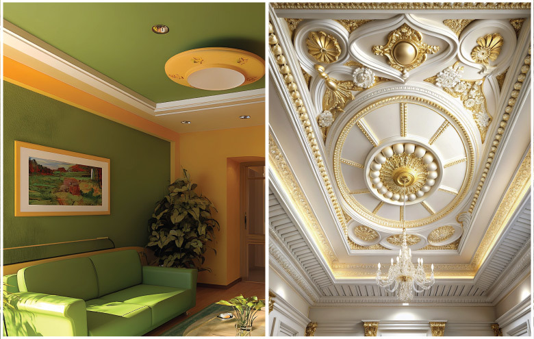
POP Colour Combinations and Design Ideas for Modern HomesSome decorating decisions are easy to spot. A bold sofa, a feature wall or patterned flooring naturally draws attention. The ceiling, however, is different. It’s not something most people notice immediately, but it subtly changes the entire feel of the room. Imagine the last time you entered into a sunny, welcoming living room. Chances are, the ceiling helped create that feeling without demanding attention. The right colour can make a room appear taller, soften harsh lighting and tie the whole interior together. That is why choosing a pop color combination is about much more than selecting a shade of white. It’s an opportunity to add depth and character, and keep the room balanced. If you're planning a new home or updating an existing one, it helps to think of the ceiling as another surface that deserves the same attention as your walls. POP Colour Combination Design Ideas1. Don't Choose a Colour Before Looking at the RoomIt's tempting to browse paint shades first. A better approach is to spend a few minutes looking at the room itself. Ask yourself a few simple questions.
A ceiling should support the room, not compete with it. 2. Living Room Ceilings That Feel Bright Without Looking PlainThe living room is usually where family members spend the most time together, so it's worth choosing colours that continue to feel comfortable every day. A pop color combination for living room doesn't have to be complicated. Warm white paired with soft greige creates a relaxed, contemporary look that works with both wooden and tiled flooring. If you prefer slightly more contrast, light grey detailing within the POP design can highlight recessed sections without making the ceiling feel heavy. Homes with plenty of daylight can also carry slightly warmer neutral tones, giving the room a cosy feel while still reflecting enough light. The idea isn't to make the ceiling the main attraction. Instead, it should quietly complete the overall design. 3. A Softer Approach for BedroomsBedrooms call for a different mood altogether. Most people want this space to feel peaceful, not dramatic, so soft colors generally work best. Pick a well-selected pop color scheme for the bedroom such as off-white paired with soft beige, pale taupe or gentle sage. These shades create subtle contrast without upsetting the tranquil ambiance. Instead of using strong contrasts, many designers prefer to layer similar tones. This allows the POP pattern to be seen without dominating the room. It's a simple technique, but one that often makes the ceiling feel far more elegant. 4. Creating a Welcoming HallThe hall often connects different parts of the home, making it an ideal place to establish a consistent design style. When choosing a pop color combination for hall, neutral shades are usually the safest starting point because they blend comfortably with adjoining spaces. Ivory combined with warm white is a classic option that suits both modern and traditional interiors. If your flooring or furniture includes darker timber, introducing a light beige accent within the ceiling design can create a little extra warmth without making the space feel enclosed. The goal is to make people feel welcome from the moment they step inside. 5. Why White Still Works, But Doesn't Have to Work AloneWhite ceilings have remained popular for decades, and for good reason. They reflect light, make rooms feel open and pair well with almost every decorating style. That doesn't mean white has to stand on its own. A carefully chosen pop colour combination with white ceiling can add depth while keeping the room bright. Soft greys, warm sand tones and subtle stone shades all work beautifully alongside white, giving the ceiling more definition without making it feel busy. Small changes like these can transform a plain ceiling into a design feature that feels refined rather than flashy. 6. Bringing Wall Colours and Ceiling Colours TogetherOne of the biggest decorating mistakes is to treat the walls and ceiling as two separate projects. In reality, they work best when they complement each other. If your walls are painted in warm tones (think beige, cream or earthy neutrals) then choosing a ceiling colour from the same family will generally create a more relaxed and balanced space. Conversely, cool greys, soft blues and muted greens tend to go well with crisp whites or pale grey ceilings. This doesn't mean every surface needs to match. A little contrast can help highlight the shape of a POP ceiling, but the colours should still feel connected. When the transition between the walls and ceiling is gentle, the room often appears more spacious and thoughtfully designed. 7. The Role of LightingPaint rarely looks exactly the same throughout the day. Morning sunlight, afternoon brightness and warm evening lighting can all change the way a ceiling colour appears. A room with natural light and a white ceiling can look fresh and airy; the same color under warm artificial lighting can look softer and creamier. This is why it’s always worth testing out paint samples before you commit. Seeing the colour at different times of day will give you a sense of how it will react when the room is finished. It is a small step, but one that can prevent disappointment later. Matte or Gloss: Which Finish Works Better?When it comes to POP ceilings, the finish is just as important as the colour. Matte finishes remain the preferred choice in many modern homes because they create a smooth, understated appearance. They also help reduce reflections, making decorative ceiling details look softer and more refined. Glossy finishes reflect more light and can create a striking effect, but they also tend to highlight surface imperfections. For that reason, they are usually used only in specific design features rather than across the entire ceiling. If your goal is a contemporary interior that feels timeless, a high-quality matte finish is often the safer option. FAQs:Q. Should POP colour match wall colour or create contrast? A. It depends on the look you want to achieve. Matching colours creates a seamless, spacious feel, while a subtle contrast can highlight the POP design and add depth without making the room feel busy. Q. How does lighting affect POP ceiling colours? Q. Is white always the best choice for POP ceilings? Q. Can I use matte paint on POP or must I use special POP paint? Q. How often should I repaint POP ceilings? Q. Which POP colours work best for small vs. large rooms? Q. Can I change POP ceiling colour without a complete renovation? |